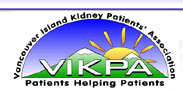
is easily understood,
so everyone will know what VIPKA’s goals are just by seeing the logo.
Patients
Helping Patients
VIKPA and what
it stands for is easily & immediately understood.
The
Sun Represents
HOPE, NURTURING
HEALING & STRONG SUPPORT.
The
Mountains Represents
Patients working
together to overcome challenges.
The overall shape gives the feeling of a community coming together
towards
a common
goal of helping one another.
The overall logo together is very positive and warm, and is visually representative
of
Vancouver Island for whom VIKPA represents. At the same time it provides a
clear
message of who is VIKPA, who it represents and VIKPA's goals of helping
patients.
Logo concept, design &
vision created by Steven
R. Noble / Animax
Design Group.
And a special thank you to Karri for her time to help with the development of the logo.